You're about to create your best presentation ever

Template Powerpoint Design

Create your presentation by reusing a template from our community or transition your PowerPoint deck into a visually compelling Prezi presentation.

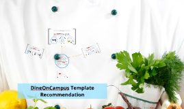
DineOnCampus Template Design

Transcript: Resources for students organized in one place Issues with current design My recommendation Conclusion Web design best practices attempt to guide visitors through the e-commerce navigation experience with stimulating visuals, color contrast, and limited clicking options. Objective: to increase e-commerce revenue Multiple Menus Final Product: Learn More now contains ways to connect and learn more about dining services like: +Social media +Blogs +Staff +News DineOnCampus Redesigned Decreased bounce rate: According to KISSmetrics, complex, scattered navigation can leave visitors "helpless, confused, or angry," causing them to leave the site, or "bounce." Increased purchases: A bold call to action button can increase purchasing by 35%, according to a case study done by ContentVerve. Less empty space on underdeveloped pages: a standard e-commerce strategy for the home page template decreases reliance on "update heavy" widgets like calendars, events, and blog posts. New, single menu Resources now contains resources for being healthy and learning about nutrition like: +Nutrition tools +Nutrition links +Nutrition Questions +Choose my Plate Many Links My proposal for the redesigned template includes one menu that has been reorganized and banners featuring e-commerce options to drive gift basket and meal plan revenue. 1. One central navigation bar to lower bounce rate 2. E-commerce capabilities with strong calls to action to increase revenue 3. Content organized logically under menu headers to make template more forgiving of under-developed content The current design displays: 1. Multiple menus 2. Non-intuitive navigation organization 3. No e-commerce functionality, calls to action, or purchasing portals New strategies No E-commerce Current Template: Two menus divide information (and the audience's attention) unnecessarily, creating a disjointed navigation experience. By offering so many clicking choices, DineOnCampus isn't able to guide the audience to important pages. In addition, he number of menu choices may confuse the audience and make it difficult to locate information. Redesigned e-commerce widget with call to action Results DineOnCampus Template Recommendation The current template for DineOnCampus is difficult to navigate, contains many links, and does not contain an e-commerce plugin, information about purchasing options, or calls to action. Recommendation: There are a number of outbound links throughout the page. Links that take the audience off the DineOnCampus website create lost revenue opportunities. In addition, many of the menu options could be consolidated or placed under headings that are more descriptive and intuitive. For example, "Resources" usually contains information to help visitors read up on ideas related to the purpose of the site. Instead, DineOnCampus features "Resource" links that allow visitors to view staff members, events, or other information normally organized under "Connect," "About Us," or "Learn More." The Current Template The current DineOnCampus template has too many menu options and does not foreground e-commerce options. The new template features one organized menu bar and several calls to action to drive meal plan and gift basket purchases. Based on Jim Harvey's speech structures I have created a new template proposal designed to increase revenue through prominent calls to action. In addition, the new design will decrease bounce rates by increasing control over visitor flow by limiting the number of links. The Chartwells Higher Eduction division is looking to redesign the DineOnCampus template to drive revenue generated by meal plan purchases and gift basket purchases (e-commerce). The DineOnCampus sidebar occasionally contains social media information, requests for feedback, or blank space. The sidebar has prime real estate on the webpage because it is above the fold at eye level. The space could be better utilized by providing a call to action button to drive e-commerce sales and revenue.

Website Design powerpoint

Transcript: Middle School is a very important time for the students moving up. They are growing up from being little elementary kids transitioning to being an older teen in high school. Studies have shown that students start to lose interest in school when they are in middle school grades (6th -8th). Many people ask why do they lose interest at this time. We will list some of the reason here: In-Classroom Methods Out of Classroom Methods What is the Importance of Fixing this? In our previous section we talked about keeping middle school students surprised in the math classroom. There are many ways to do this but were going to talk about two major ways. Games- Games can be an important way to keep your middle school students interested and on task in the classroom. Of course these games need to be relevant to what your doing in your class. Here are some links to websites for games and activities: http://www.education.com/activity/middle-school/math/ http://www.learn-with-math-games.com/ Group Activities- In your classroom you probably will have a lot of times where students work individually ,but as teachers you should have times where your students work together in groups. Maybe during a exercise after a lesson or working on a study guide. This is another way to get the students to learn good skills socially and also in the lessons. Why Middle School Students Lose Interest? Home How to Keep Parents Involved Reasons Middle School Students Lose Interest Home Ways to Vary Out Of Classroom Work In-Classroom Methods mean ways to keep students interested in your subject area (in this case math). KEEP THEM SURPRISED Use activities like games and group work What Brings about these Reasons? Reasons Peer Pressure Popularity Drugs Disabilities Why Middle School Students Lose Interest. In-Classroom Methods Out of Classroom Methods Parental Involvement Keep Their Interest Middle School Math Social Problems Starting to Struggle Academically And Many More Parental Involvement KEEP THEM SURPRISED!!! There are some ways you can make your middle school homework more interesting for your students and it will make them enjoy it more also. One way you can do this is to give them assignments like finding jobs that this math lesson could help them do or when doing percentages have them find something in one of their favorite things that has percentages like tax on clothes or shooting percentages. You can also make project more interesting connect to their live and have them understand what their doing and why their doing it so the students don’t think its pointless. As mentioned earlier Middle School is a very important time for students because of the transition time. This is a time where teachers, parents, coaches, or anyone involved with their lives need to try hardest to encourage students to stay on task and work hard because if we as teachers and adult keep them interested and working hard then we are doing out job of leading the future generation. Home Home A good way to keep Middle School students interested in math or academics at all is to keep them surprised in the classroom. Some students get bored with the everyday lecture and homework problems. By keeping your students moving and doing different things in the classroom their interest level will rise and they will stay interested in math and should do well academically. Some ways to keep them surprised it to use games and group work in the class. Reasons Middle School Students Lose Interest. Why these reason present themselves? Why is it IMPORTANT to fix this problem? One of the most important things in schools is having good parent involvement in your class. In math it is statistically known it is one of the more challenging classes in school. So math teachers especially need to have contact with parents and be able to keep them up to date on what is going on in the classroom and if their child is struggling. In the classroom a big question for teachers is how to keep the parents involved with their kids schooling. Well here are some ways to consider and look at: Have an online site for you classroom. This can be a very helpful way to keep your parents involved and let them know what your class is doing and what assignments are dues and when tests are going to be held. Send home weekly progress reports to be signed or maybe every other week. This will let parents know what grades their child is making. Keep these signed reports too so if a parent comes to you saying they had no idea then you can pull it out of your files. Use Activities in the Classroom like Games and Group Work The reasons we listed are some of the major things that cause students to lose interest. We are going to explain why some of these reasons come about. Peer Pressure occurs because sometimes a students friends put pressures on the kid to be a nuisance or do other things to effect the students academics negatively. Drugs can be a huge reason because If a student gets involved with drugs it mean they are

Effective Powerpoint Design

Transcript: Which Linearity to Choose? What is Linear vs Non-Linear? This title is far too dark for this background Linear or Nonlinear References There is nothing inherently wrong with either one, they just serve two very different purposes. Nonlinear allow for an easy presentation of multiple subjects or sub-categories, not always related, such as general design tips and linear vs nonlinear comparison. It allows an easier intractability to refer back to past information. Easy to integrate audience participation. Linear is effective at portraying a clear single subject or goal Timing is generally very predictable and easy to plan. Easy to summarize points or imparting facts. Conclusions Effective Presentation Design Nonlinear Presentations This text should probably be split up into different sub points via bullets but instead I’ve made an unsightly wall of text that is visually overwhelming and distracting to those that are viewing the presentation. The lack of spaces and overuse of text rather than outlining and allowing for the oral presentation to fill in the details also muddles the overall effect of the presentation. Overuse of wacky transitions and overly long animations is incredibly distracting when presenting information. Colors such as light blue or light yellow should probably be avoided for those with color blindness. Besides too many pictures, many are covering text or serve no real purpose. Each design of presentation isn’t good or bad, just used for a different purpose. Linearity is focused on fact presentation. Nonlinearity is focused on interactivity and flow. Slide design should conform to design standards. Color should stand out against the backdrop but not be blinding. Maintain a color scheme throughout for cohesion. Over use of transitions and animations is a major distraction. Having text structured makes it more clear. This being underneath and smaller text provides hierarchy and shows this is a related point. This also allows the view a clear means of identifying what you’re talking about. Clarity in text contrast and pictures to assist but not clutter is key to good design. This white, for example, shows well against the red backdrop. Ensuring images don’t cover text is also important. Good Keeping it structured and outlined. Use bullets to show what points are subordinate to overarching statements Especially for voiced presentations, don’t include every word you wish to say in the text, just outline the points. Light transitions and low stylization. Transitions can keep a presentation interesting as long as it’s not overly utilized. Use of pictures or video (non-autoplay) to support your point. Linearity allows for a step-by-step structured series of slides most effective in conveying facts or information that has little need for audience participation. Despite the transitions making it seemingly non-linear, this presentation is linear, as it follows a fixed path. Good and Bad Design Choices Thank you! We will discuss the best ways to make the best presentation possible. Picking between a linear or nonlinear style. Effective means of conveying a message. Pitfalls many presentations succumb to. Nonlinearity tools like prezi greatly help in managing clutter. The ability to zoom into smaller text allows it to not take up space on previous slides. Transitioning to focus on a video or picture is also very easy with varying slide sizes. Good Example Linear and Non-Linear Ways to Make the Best Presentation Linear Follows a set path going forward from slide to slide. Can’t go back to a previous slide. Generally forces conclusions for a section to be at the end. Uncomplicated, but that’s okay. Non-Linear Can reference back to past slides more easily. Can jump only to certain slides of information. Link between slides more similar to a website. Effective for unguided presentations. Now that you have an idea of which type of presentation to choose, slide design is also important. Many powerpoints stumble because of ineffective or overly cluttered design. Many mistakes come at the most fundamental level, making the wrong type of presentation. Being able to identify if it’s a simple, single message or user interactivity is key in initial design choice. Over-focus on nonlinearity in a powerpoint that really only needs to be a linear summary can seem overly complex. Linearity can be perceived as boring. This text has high contrast to the background By David Rosenberg How to Make an Effective Presentation Presentation Best Practices Knickerbocker, Vicky, and Brent Olsonawski. "The Good, The Bad, and The Ugly: Powerpoint Basics." Inverhills. N.p., n.d. Web. 17 June 2014. <https://www.inverhills.edu/StudentSuccessDay/pdfs/TheGoodBadandUglyPowerPointBasics.pdf>. "Microsoft PowerPoint 2003." PowerPoint 2003: Linking and Branching, UWEC. N.p., n.d. Web. 17 June 2014. <http://www.uwec.edu/help/PPoint03/lnkbrch.htm>. "Non-linear PowerPoint Presentation." Non-linear PowerPoint Presentation. N.p., n.d. Web. 17 June

Template Design

Transcript: Motivation Motivation Advantages both economically and politically. Influence public opinion, thus the ability to impact societal perceptions and even shape policy decisions. Can work as a framework for policymakers, social media platforms, and civil society to monitor and respond to the evolving landscape of political discourse. Keep your words short and punchy so your audience stays focused. You can add imagery and frames to keep their attention where you want it. Methodology A pipeline with 5 stages+ Data A pipeline with 5 stages+ Stage.1: Preprocessing Stage.2: Topic Modelling Stage.3: Event Detection Stage.4: Story Extraction Stage.5: Competing Narratives Detection 1.2 million tweets of European politicians extracted from Twitter for the period from January 1, 2022, to December 31, 2022. Tweets are narrowed down to tweets authored by German speaking politicians in 2022. Extracted tweets attributes: 'id', 'user-id', 'date', 'text', 'lang', 'translation' and 'sentiment'. Map of user party affiliation, which includes user IDs and their corresponding party affiliations. (Source: Wikidata) Put a bold statement here Use this space for details that you haven’t talked about yet. Relate what you’re saying to the nearby image so your audience has a visual, too. Use this for a powerful quote or statistic. Content Motivation Introduction.. Data. Method. Evaluation. Conclusion. Automated Identification of Competing Narratives in Political Discourse on Social Media Ahmad Hamadeh Hannover, den 15. Mai 2024 Conclusion

Now you can make any subject more engaging and memorable