You're about to create your best presentation ever

Brand Identity Presentation Template

Create your presentation by reusing one of our great community templates.

BRAND IDENTITY

Transcript: Using white font will be featured in the magazine and the billboard poster, and the use of landscape images will create the indirect house style of blue and green. This will be recognisable and my audience will easily be able to associate the billboard poster with the magazine. 'BRINGING THE LOCALS OF LEICESTERSHIRE CLOSER TOGETHER' Throughout the magazine I will only be directly using black and white in my house style - this creates a simplistic and informative perspective of the magazine and avoids overcrowding or unnecessary colours. The billboard poster will feature an image of the front cover of the magazine which increases the likelihood of my audience recognising the front cover in shops and enable them to know what they are looking for. IDENTITY Radio advert - 'Search Leicestershire Living on Facebook, Twitter, Instagram or Pinterest now' Billboard poster - Search 'Leicestershire Living on'...social media icons Magazine - references to social media in all pages. I will include on the contents the audience tweeting their views on certain things. The font will be santander which I found on dafont.co.uk - this will help create a bigger brand identity. The font is simple and sophisticated meaning the name of the magazine will stick in the reader's head My tagline will be featured throughout all three of my media products. I will quote it on the radio advertisement, it will be featured on the front page and the contents of the magazine and finally it will also be on the right on my billboard poster. This will create a bigger brand identity as more people will identify the tagline BRAND Through my research I have found out that social media is vital to creating a successful advertising campaign. My brand will have it's own website, Facebook, Twitter, Instagram and Pinterest page. This way I can advertise and associate the brand with people around Leicestershire and my audience can communicate with the magazine - they can mention them in tweets and hashtag Leicestershire Living on Instagram, for example. This addresses the issues with print only magazines not being so successful and the new developments of converged devices. The references to social media are prominent through the billboard poster, the radio advertisement and the magazine. On my billboard poster, I am going to create silhouettes of various well-known landmarks in Leicester. This will include The National Space Centre, High Cross, Clock Tower, a church and Old John. The images used on the billboard poster will relate to those used in the magazine. The image of Bradgate Park will appear on the front page of the magazine and the main image on the billboard poster and both will include countryside images. This shows that the same types of images are being used and many people will recognise this My main product is a four page spread of a regional magazine, including the front page, contents and a double page spread. My two ancillary products are a radio advert lasting 20 seconds and a billboard poster Indirectly, my house style will include blue and green which is done through the use of landscape imagery. The blue and green contrast the white and blue by offering connotations of freedom and tranquility against the connotations of informative and seriousness. If my product was going to be published in reality, I would create a Leicestershire Living app that offered the audience in-app purchases in order to read the magazine through their iPhones or iPads. My background images for the magazine and billboard poster are of landscapes creating a contrast between blue (sky) and green (earth), I will use the same masthead in white which will create the link between the two. This is a simple way of creating a bigger brand identity but still effective.

Brand Identity Presentation.

Transcript: What Is Brand Identity? By Katanna W A Brand is a form of art, a form of the creator’s idea what comes from them and what is presented out into the world. Brand Identity is something that expresses a form of company,store,products or a person in general. There are different formalities of different brands in the world and what they represent. The importance is to bring something out and not be left out. The difference between the two is... a brand is to catch the customer’s or the viewer’s eyes to be interested in purchasing from that company or that particular brand. for example, clothing or a lemonade stand. a brand identity is basically identifying what type of brands out there and to express to the world The brand’s primary function is to make something seem more exciting that a person or a customer or any other company would want. The following are different types of identity and the process to established these brands are… Conducting research: They gather up information to establish or, portray any kind of branding in the world. Developing a Strategy: These designers that you see make the top brands or logos need to develop a way or strategize to make a brand more suitable, popular or in fact, Stand out. Designing identity: It takes a lot of time to design some sort of identity for their company or whatever they are doing without the use of repetion, copy right or plagiarism. Creating Touch Points: Every touch-point that is in any way associated in customers’ minds with the brand identity of a business contributes to the customers’ experience of that brand. This means every piece of marketing communications, sales contact, service delivery, customer service interaction, and business system that the customer comes into contact with can impact the brand image and customer franchise. Managing assets: Managing brand identity assets requires having leadership and long-term commitment to doing everything possible to build the brand. The idea to build the brand must come from the top. If management’s commitment is minimal and the resources committed are not so great, the original investment may crash the idea so they do kind of need to be committed to it… :/ Touchpoints are what creators use to impact on different types of people or companies. examples of these would be... - Social networking - TV - Retail - Radio - and Outdoor advertising The reason why a company would use touch points... so they can create an idea for different types of things they use to create... the ultimate brand, Brand identity And/or logo For Success within the company!

Brand Identity

Transcript: Brand Identity Ellie Goulding The front and back of the album cover connotes a clean and modern look. It shows the artist is Independant enough not to rely on visual clutter to bring in a audience. It focuses more on White space (block of colour;Black). Ellie gouldings album 'Lights' Co-ordinate a Sans Serif Type face. The curves and simple letters make it to be feminine. This could be a bad thing as this would only be attracting one audience. But it can also be seen as Serif. This is seen as a masucline typeface and is usually very simplistic like the above, this appears to wider audience. Ellie Goulding is using indirect address which suggests maybe the album is not as personal as some but it is still an ambient album as the expression on her face is calm. House colours can be easily seen as Black and Gold, On the Front of the album cover, The gold is highlighted as glitter and it also blends in her hair colour and skin tone. The black arises in the background and from her top! The typeface is also Gold but it is a Gold lighting effect to go with the album name 'Lights'. The back cover on the album hightlights the text in Gold and the background clearly as black. Image is of the lungs which the artist is wearing is mimicing the album title and the style is powerful and gothic which is suggested by the lungs. This could be the artits' unique selling point as no one else has used this as a motif before. Both images show visual clutter. The album cover shows visual clutter of images whereas the visual clutter on the back side of the album shows a text clutter. The typeface is chuldlike and feminine as it uses the Sans serif type face. Could represent a wider feminine audience. The artist uses Black on white 'WOB' as a gothic style. The bright lighting also relates that as her skins looks very pale, this could be a part of the white on black. Alexa Povey House colours will consist of Black and Gold as they are contrastion colours and they are also block colours. The eye shadow could be situated around the house colours therefore her eyes will stand out. Image motif is still the eyes, On our digipack the Image motif of eyes will be made clearly to stand out top of contrasting colours. no visual clutter, more clean and modren to amke the artist look independant. Sans serif typeface will be used to show the femininity of the artist. Initial Ideas (cc) photo by Metro Centric on Flickr (cc) photo by Metro Centric on Flickr (cc) photo by jimmyharris on Flickr (cc) photo by Franco Folini on Flickr

Brand Identity presentation

Transcript: Brand Identity Presentation All Things Wildlife Brief Client Brief The brief tells us to design a suitable brand identity for the company called “All things Wildlife”. The logo designed will be used as part of a new website and also in supporting marketing materials from Business Cards to brochures to digital promotions. A social media presence will also be addressed as the logo will be used on popular social media apps such as Facebook. We need to take in consideration for the logo to appear in 2 formats, these being portrait and landscape so these two could be used on different platforms. the logo could be changed based on layout as it can be suited better in landscape on a business card and website but a portrait version could be better suited for social media based on the layout preference. History of the company History of the companies The national geographic society was found in 1888 by a group of scholars, explorers and also scientists. They met to discuss the organization of a society for the increase of geographic knowledge. Two weeks later, on the afternoon of Friday, January 27, a certificate of incorporation was formally signed. The National Geographic Society made contributions to exploration, science, and conservation. These contributions include assisting in the establishment of the National Park Service, exploring and mapping areas of the world, discovering sunken and buried treasures and also restoring archaeological sites. National Geographic logo In terms of product ranges, National Trust have a variety of products, they mainly cover toiletries, accessories, garden decorations, pet accessories, food and drinks. Based on services The National Trust Textile Conservation Studio is one of their main services, the Studio aims to provide their clients a complete conservation service for historic textiles, their team of conservators undertake a range of activities including estimates, condition surveys, advising on preventive conservation, display, storage, routine care, disaster planning, emergency treatment, studio based practical conservation treatments and on site work. Another service they provide is caring for historic places and areas of countryside as they are a charity. National Trust logo Target market/ Demographic Target market/demographic The target audience for the brand "All things wildlife" are people who have an interest in nature, there is no limit in terms of age, they could possibly already have a hobby of bird watching or any type of animal watching. Since this brand is about nature it would mainly be beneficial for any generation as the brand helps them view nature in a more appealing way, the activities the brand offers vary based on age so that the customers could do something they prefer. Development Development When developing my homepage as a team we decided to combine an element from each others work into our own homepages to make them more effective in terms of its style and purpose and so for my homepage I took the elements of image layout, homepage bar position and also inserting a gallery tab. In terms of developing the logo I digitized it by using a cutout of a log to make it realistic as possible, the abbreviation has also been changed using the 3D tool from Adobe Illustrator to add the engraved effect, the full name for the brand that is written below the logo has been changed in terms of position as the technique of an arc has been added to it, this is to add complexity to the overall logo. The colour scheme for the text has been kept simple with the colour brown being chosen from the log, this is because this colour helps reflect a theme of nature. For the semiotic logo development I picked the best design based on feedback and created a more detailed design, I added the technique of boldness into the sketch by using a fine liner to create more of an emphasis and to also add more depth into the logo. In order to develop the typography designs I had to use a scanner to copy the hand rendered drawings so that they are as clear as possible when editing them digitally. Home page mock up designs Typography development designs Semiotic logo development design Logo development Initial ideas Initial ideas homepage mock up design This first design is of the website for the brand "All things wildlife", it is a mock up of the homepage that would be used in a portrait layout. I chose to have the web page bar on the left side as it made the layout more unconventional, this makes it more attractable as it gets the viewers attention with it being unique, I have also balanced image with text by scaling some pictures to a bigger size, this makes the text look less overwhelming. In terms of logo design I sketched out a log as the theme of the brand was based around wildlife and added the abbreviations of the title at a tilt within the log, this gave the affect of it being engraved within the log, underneath the logo I have added the full name of the brand so the viewers do not

Brand Identity

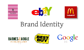
Transcript: A big part of Google's success is due to the simplicity of its design. The large amount of white space is uncluttered and creates an clean, straightforward appearance which is easily navigable. Against this white background, most of the information is displayed in black and grey neutrals for a no-nonsense, professional presentation. Key information is displayed in bold colors and small print, drawing the eye and making them easy to find without creating too much noise. The most color is found in the logo, consisting of bright, saturated colors. These colors are the ones seen in a crayon box or on a child's toy; red, yellow, blue, and green. These are the colors assoccicate with the most basic things in our culture. They are also very bright and attractive, each one complimenting the other. The colors chosen by Google sucessfully represent the basic nature of the site while keeping its plain look from being boring or appearing too corporate. The signature color of Victoria’s Secret is pink, ranging from heavily saturated magenta to rosy beige. The company has created its entire image around this color and uses it almost exclusively. The use of pink is largely based on gender associations and it creates a highly feminine image for the store, selling almost exclusively to women. The use of various tones, saturations, and shades widens the age range of their target market. Their “Pink” collection uses bright, saturated pinks and is directed to teens and young women. Other collections stick to muted, light, or natural pinks that are elegant and sophisticated and appeal to adult and mature women. The same is true for their advertisements, which show the same wide range of pinks. Pink often promotes youth and beauty, and though some women may not be attracted the “girly” color, the company attempts to play to a variety of women by exploring every variation of pink. Sharing an almost identical color scheme with Google, Ebay's colors also create a basic, straightforward appearance but for a different product. For Ebay, this color scheme not only makes searching easier, but it also shows a customer the site is legitimate. The simple white layout is readily associated with professionalism. This color scheme may do the same good for Ebay as it does for Google, but Google's size and success may prevent these colors from ever being another company's signature. The main colors used to promote Barnes & Noble are neutrals such as white and brown as well as green and gold. The shades chosen are dark and earthy, promoting calm and sophistication. They are sensible colors for the product and atmosphere of the store in that they promote the emotions commonly associated with reading a book. The colors used by Barnes & Noble are not loud and do not draw the eye like the bold colors used by many companies. Instead they are reserved and balanced, which suits the product well. This kind of stoic-natured marketing has the capability to stand out in a screaming match of advertisements and also hold strong on its own. The combination of green, gold and neutrals allows Barnes & Noble to remain interesting while successfully promoting its product. Brand Identity The colors used to represent McDonalds are red and yellow. Being warm, saturated and loud, these colors are attention-grabbers and hunger-enducers. A McDonalds sign can be spotted from miles away and you always know who it is. Red and yellow are highly successful signature colors as they are bright and attractive on there own, but together they contrast without clashing. These colors also evoke feelings of hunger and thoughts of food. The use of these colors are very persuasive in just the right way and will likely lead a customer to make their food choice without a moment of concious thought. Yellow is a great attention-grabber, though it has little to do with the technology being sold. The vibrant yellow is often associated with value, marking a bargain or an item on sale. Using this bright yellow indicates the merchandise is inexpensive, appealing to a large market for affordable electronics. Blue and black contrast with yellow and increase its attention-grabbing effect. These colors effectively scream, “Hey! We have the cheap stuff you’re looking for!”

Now you can make any subject more engaging and memorable